01. Overview
The 8sianTV app is an online video portal that offers premium TV channels, films and short video clips through TV, mobile and website.
Rather than providing mainstream American episodes like Hulu, Netflix, it is more focusing on Asian culture to attract users, especially Asian people, as it is located in California that has the largest amount of Asian people.
I was the one of three designers focus on the mobile app flow, with 1 Project Managers, 3+ Business Analysts & 3+ developers.
02. The Problem Space
You might be familiar with this scenario, for instance, you are TV lovers, big fan of a popular Chinese show in YouKu, and for some reason in order to watch the Korean TV drama, you have to download another video app, such as Viki.
You’re tried to download different video apps so that you could catch up with your favorites videos. Yes, this usually happens in daily life when you were hoping to download ONLY one app.
There were a lot more to this project, but I am only using this example of my design thinking process.
The Approach
Our initial idea was to develop better functionality app than our other competitors. To differentiate ourselves in a video competitive market, we need to find out the most popular Asian channels from hundreds of candidates to appeal to Asian users and build up with a unified video platform, multilingual the web, the mobile app to create something useful and meaningful.
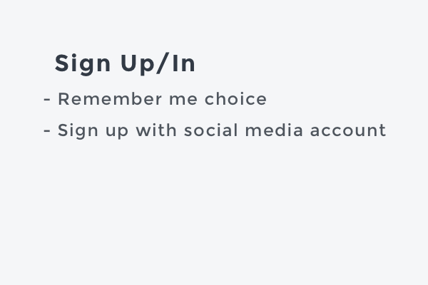
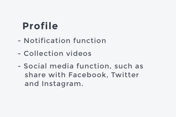
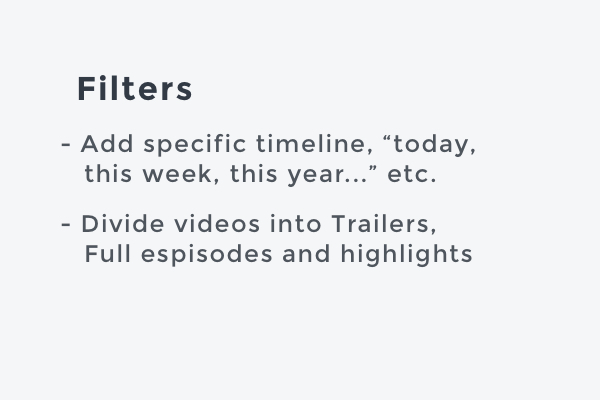
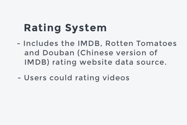
After research and discussion, we figured out the mainly Information Architecture for this Video App.
03. Design Process
Low-fidelity Design
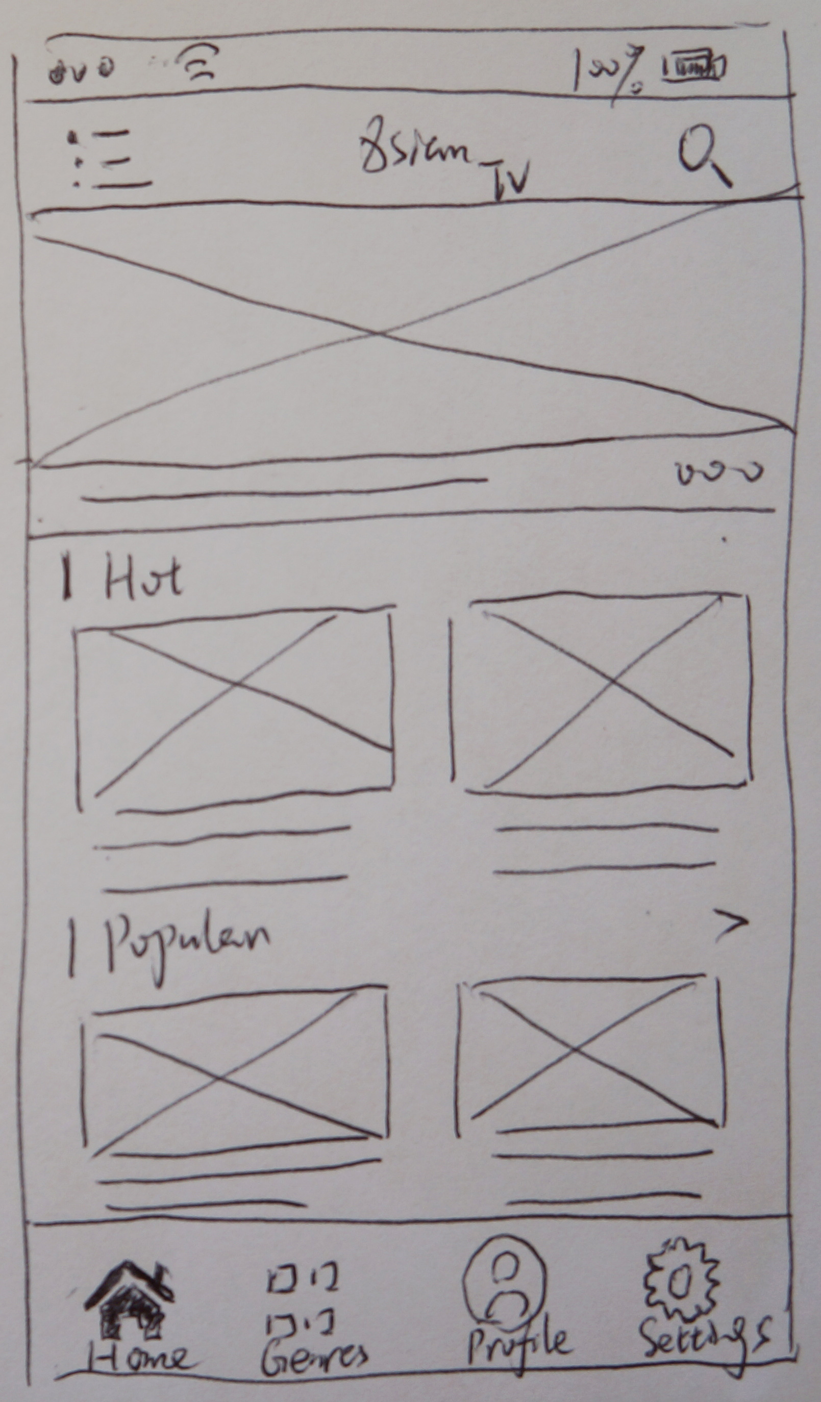
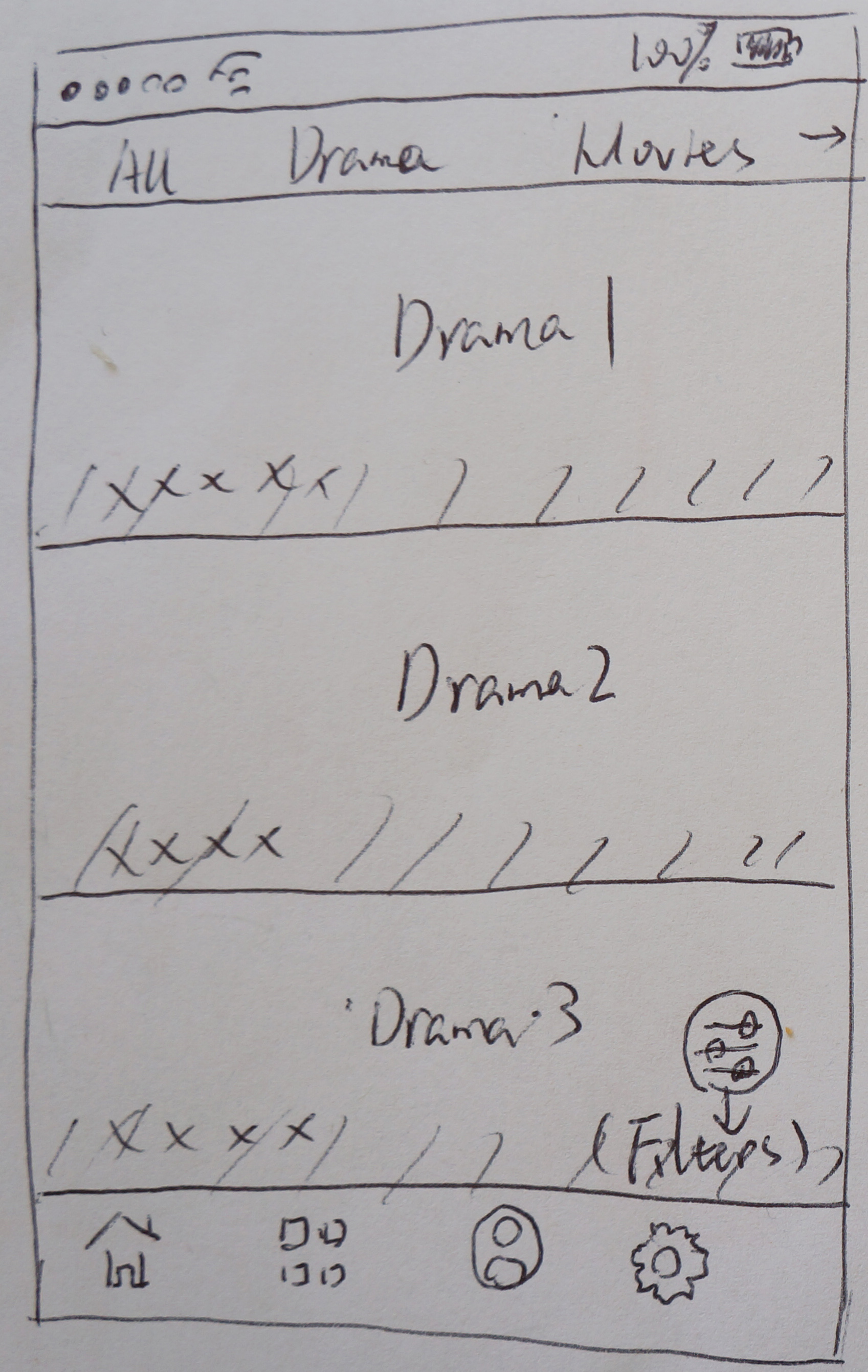
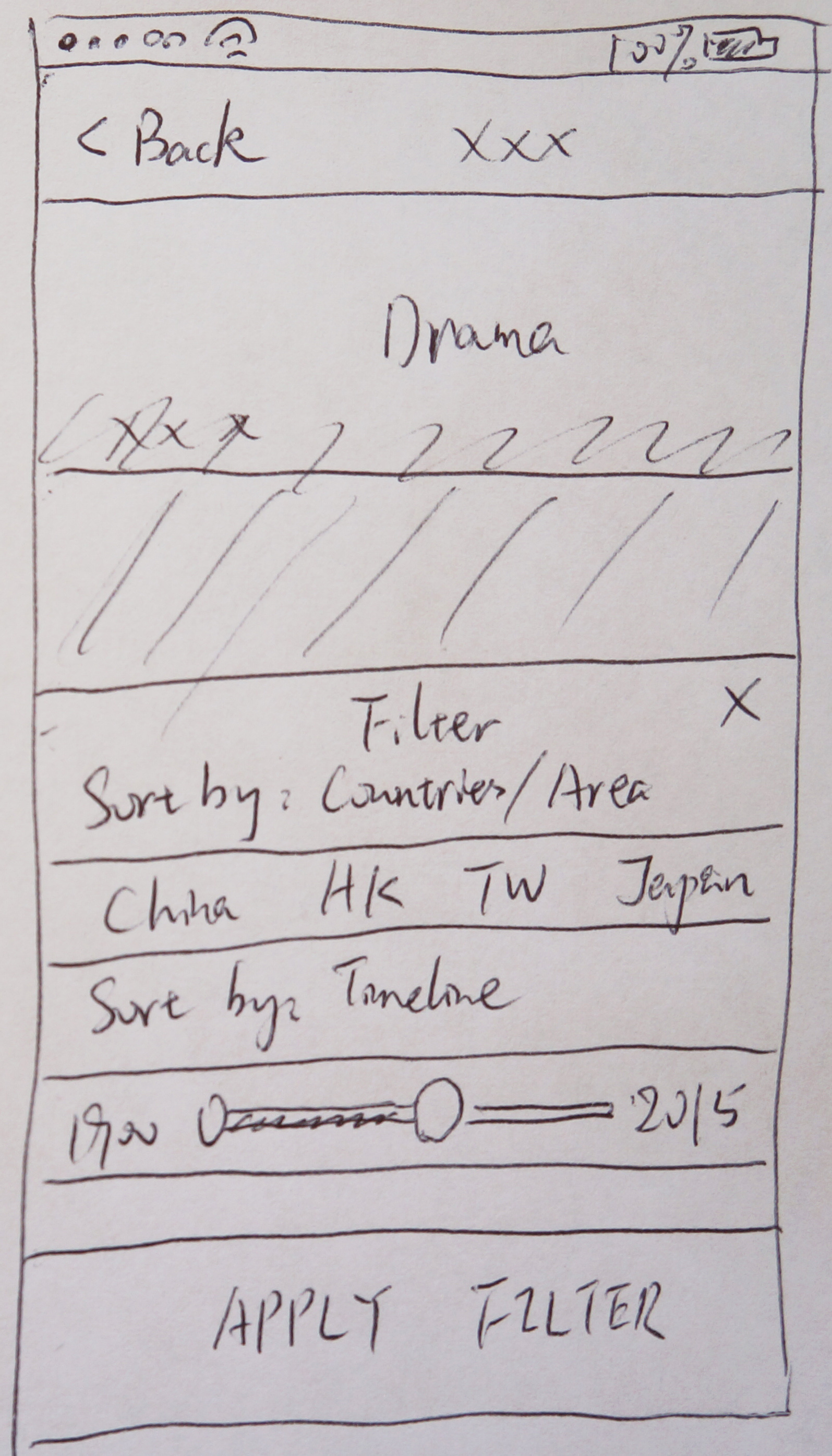
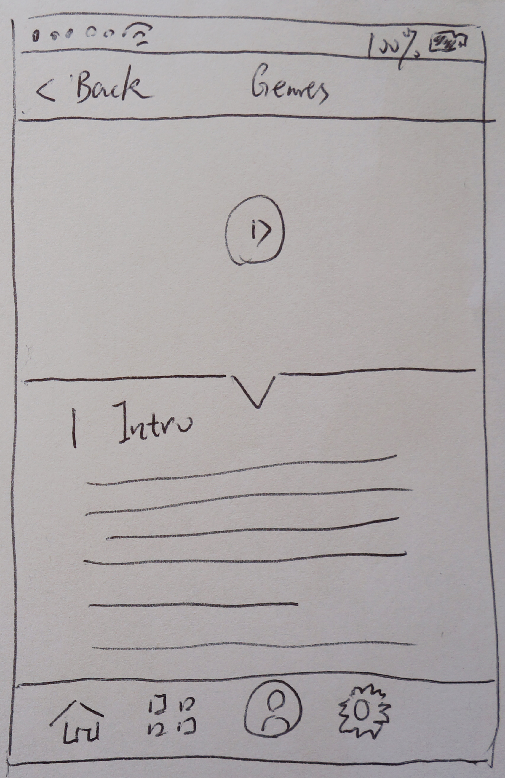
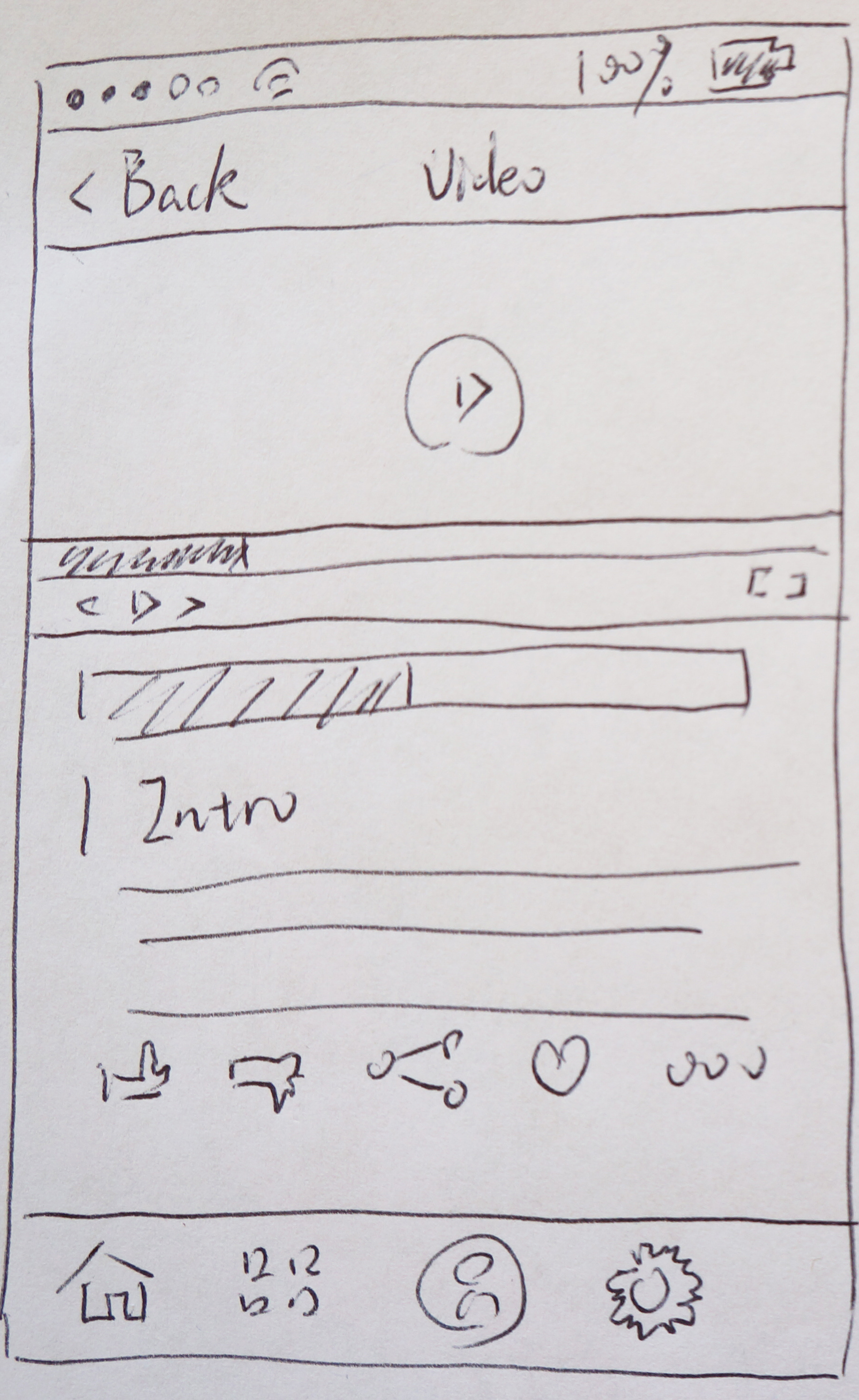
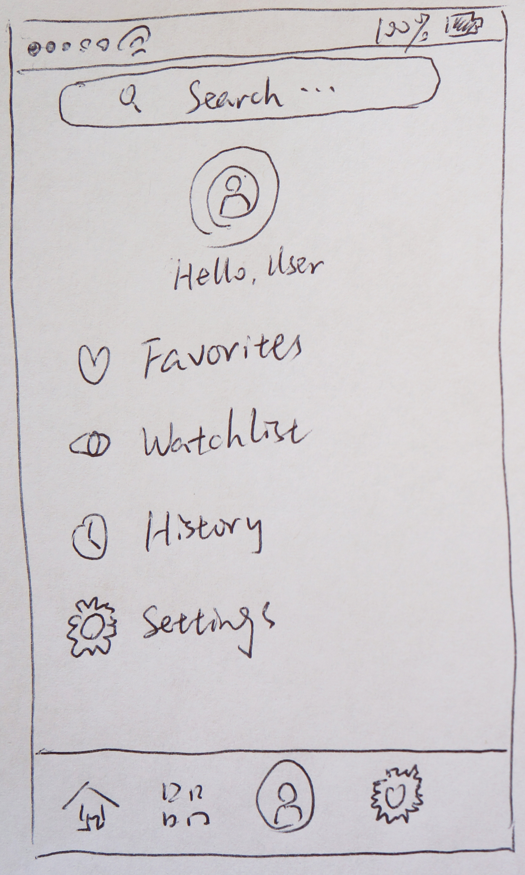
We defined the overall structure of experience to be multilingual feature web products. By sketching and flowchart, I created stacks of ideas about the UI, functional data elements and interactive behaviors. A comprehensive multilingual design began to piece together. Here are some paper-prototyping sketches.
High-fidelity Design
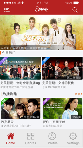
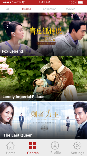
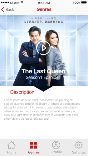
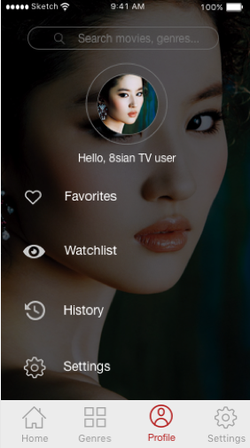
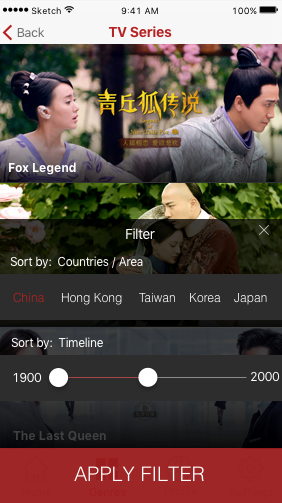
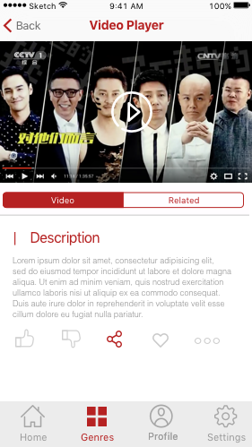
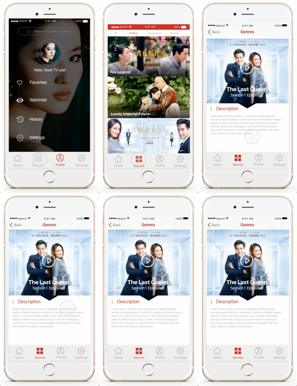
These are High-fidelity prototype designs, including the mainly page, genres and genres details page, user account, tv filter settings and video player.
A Better Solution
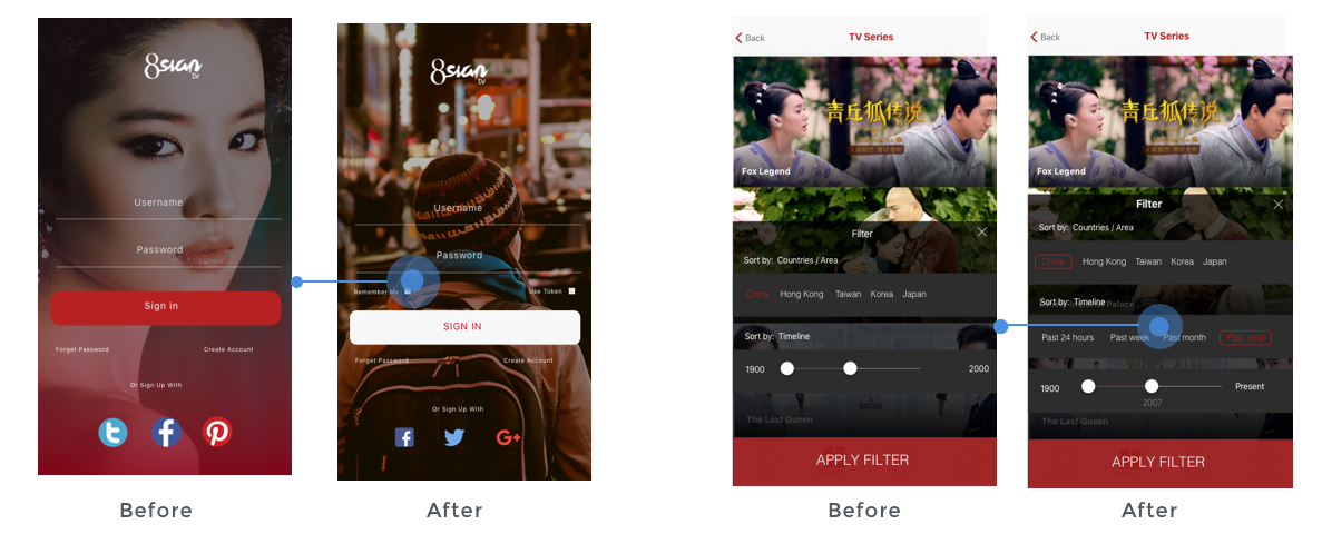
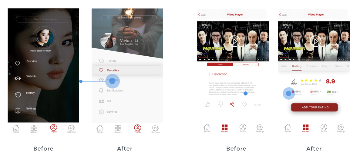
According to the user’s feedbacks and usability testing results in the first round, we have made some changes and revisions.
Designed for User-centered
The interface design strives to be confident. It does not contain UI‐bling or unnecessary elements. We opted for clear, readable typography. The design is clean, large and well spaced. Moreover, we carried the user-centered conception for every design decision-making. (App is under testing right now and will be coming soon in Late 2016)
04. Results
Testing & Feedback
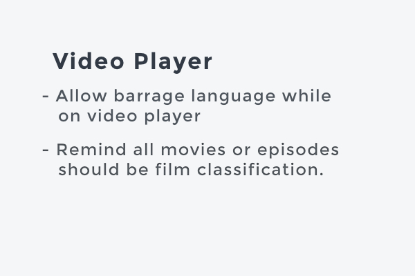
We asked some target users to do the usability testing and select some of the summary feedbacks for each category in-app contents.
What you’ve seen here is a very small part of the project and I have been working on it for a little bit, including design, usability testing, and iteration. We still have a lot of work to be continue, and hopefully you can try out the app ASAP and let me know if you have any feedback!


